Coloring in Thresholds with Graphite
In the upcoming 0.9.3 release of Graphite, I got a quick patch in for a small problem that stopped me from doing something I'd wanted for a bit - adding error thresholds on charts. While I love having my email and chat slammed with threshold alerts, I've also thought it would be nice to see a historical perspective of those thresholds in the charts. The end solution is decidedly not pretty, but it's functional and gives me something useful to look at.
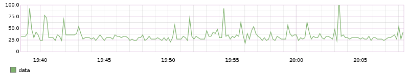
To start, I'd have a normal chart showing something getting measured. I'd separately have threshold alerts on this, either collecting the metric independently or pulling json data from graphite.
render?target=alias(metric.name, 'data')&yMin=0&yMax=100
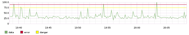
What the triggered alerts didn't easily show me was if there was any pattern to the metric crossing that threshold - was it correlated with another metric? a time of day? They could show me timestamps of a few past events, but that was it. With constantLine, I could overlay a simple line at a y-value that lined up with the 'danger' and 'critical' thresholds the alerts were sent out at. Zooming out on a chart like this, I could eyeball patterns or add additional metrics to look for correlations.
render?target=alias(metric.name, 'data')&yMin=0&yMax=100
&target=alias(color(constantLine(75), 'yellow'), 'danger')
&target=alias(color(constantLine(90), 'red'), 'error')
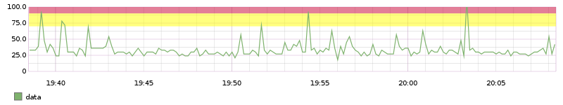
While that works, the lines can get lost if there are lots of metrics, and the yellow line isn't the greatest. Graphite has areaBetween, which lets you set a background color (and label) that goes between 2 other metrics, and that's exactly what I wanted. Before 0.9.13, trying to use areaBetween with constantLines failed with a bit of a cryptic (to an end-user) error. Eventually I dug in, made a patch and happily got it accepted, letting me make my silly charts. I used a nameless alias in this because to me, the meaning of yellow and red backgrounds is known, whereas the constantLines alone could be misinterpreted as metrics.
render?target=alias(metric.name, 'data')&yMin=0&yMax=100
&target=alpha(color(alias(areaBetween(group(constantLine(70),constantLine(90))),""),"yellow"),0.5)
&target=alpha(color(alias(areaBetween(group(constantLine(90),constantLine(100))),""),"red"),0.5)
So yeah, I've got my ranges now and dipped my toe into contributing to the Graphite project. Open source is neat.